By Andre Perunicic | April 24, 2018
I recently started using Ant Design as my go-to React component library over ported frameworks like React-Bootstrap or React Material UI. There’s a lot to love about Ant Design: it follows a collection of well thought out design principles, has a comprehensive component library, and can easily be customized through a simple theming system. It also uses Less as its styling language, which is unfortunate if you want to transition an existing Sass-based project to Ant Design, or if you simply prefer using Sass to style your components.
While it’s possible to naively use Ant Design in a Sass-styled project, doing so comes with a few frustrating limitations. To see why, suppose that you were looking to create custom components consistent with Ant Design’s styling, responsive breakpoints, and animations. Since you wouldn’t be able to access Ant Design’s theme and color variables from your SCSS files, you would have to manually extract the values you need. Ant Design uses relatively complicated JavaScript methods to compute hundreds of theme variables from a few core values, so you couldn’t even copy the values you need from source. Moreover, since Ant Design has to be customized through Less, any change in the theme would require stopping your development server and manually re-extracting the desired variables.
To solve these problems, we created a Webpack plugin called antd-scss-theme-plugin. With it you can:
- Customize Ant Design by specifying theme variable overrides through a single
theme.scssfile. @importAnt Design’s theme and color variables from yourtheme.scssfile.- Hot reload your project when
theme.scsschanges.
The plugin is designed with ease of use in mind, and uses almost no configuration in addition to what is already needed for Ant Design and Sass.
In the rest of this article, I’ll describe how to configure and use antd-scss-theme-plugin in your projects.
Setting Up antd-scss-theme-plugin
To get started using antd-scss-theme-plugin, you first need install it from npm as a development dependency.
yarn -D install antd-scss-theme-plugin
Then, after importing antd-scss-theme-plugin, add an instance of the plugin to your Webpack config’s plugins array.
Note that the plugin’s constructor accepts the path to your theme.scss file as its sole argument.
const AntdScssThemePlugin = require('antd-scss-theme-plugin');

const webpackConfig = {
  // ...
  plugins: [
    new AntdScssThemePlugin('./theme.scss'),
  ],
};
I am assuming that you are using sass-loader to compile SCSS files, and less-loader (instead of precompiled stylesheets) to compile Ant Design components. For more details on how to set up the latter, check out Configuration Step 1 of the plugin’s README on GitHub, or explore the fully configured example project.
You also have to let the plugin know about your less-loader and sass-loader configurations.
To do so, just wrap each configuration with AntdScssThemePlugin.themify().
For instance, your sass-loader configuration might go from
{
  loader: 'sass-loader',
  options: {
    sourceMap: process.env.NODE_ENV !== 'production',
  },
}
to
AntdScssThemePlugin.themify({
  loader: 'sass-loader',
  options: {
    sourceMap: process.env.NODE_ENV !== 'production',
  },
})
Finally, create the theme.scss file and get ready to customize!
Customizing Ant Design’s Theme
Before talking about customization, let’s quickly touch on how Ant Design’s theming system works in the first place.
Ant Design uses more than 400 color and theme variables to style its components.
This is not as unmanageable as it sounds, as many of them are derived from a few seed variables such as basic colors like @primary-color and @background-color-base, sizing variables like @font-size-base and @btn-height-base, responsive breakpoint variables like @screen-xs, @screen-sm, and so on.
You can actually get pretty far if all you change is the value of the @primary-color variable, since that would cause a cascade of changes and result in a coherent design.
For example, here’s what changing @primary-color from its default blue #1890ff to a louder orange #fe8019 looks like.
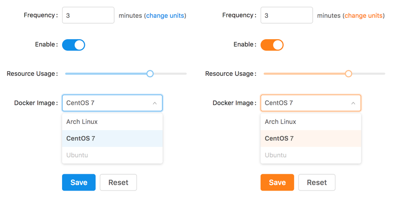
To accomplish this @primary-color override without the plugin, you would typically set the modifyVars option of your less-loader to { '@primary-color': '#fe8019' }.
With antd-scss-theme-plugin, you can instead specify the override through your theme.scss file by defining the variable using SCSS syntax.
/* theme.scss */
$primary-color: #fe8019;
You would then be able to access all of Ant Design’s variables by importing theme.scss elsewhere in your project, no matter whether they’ve been explicitly defined in that file.
This includes newly re-computed variables such as $primary-1 through $primary-10, but also non-affected ones like $warning-color and $layout-body-background.
/* component.scss */
@import './theme.scss';

.component {
  background: $layout-body-color;
  border-color: $primary-9;
  color: $warning-color;
}
To find which variables you can import and override, look through Ant Design’s default.less theme entry point, or the list of utility color sequences in colors.less.
After you’ve picked a variable, simply change @ variable prefix used in Less to a $ used in Sass.
For instance, in the example above I’ve taken @layout-body-color from default.less, and imported it as $layout-body-color.
Hot Reloading Ant Design on Theme Changes
If you’re using something like webpack-dev-server to enable hot reloading in your project, then antd-scss-theme-plugin will work with your setup.
Any changes you make in theme.scss will propagate throughout your project without a development server restart.
Since variable overrides typically have to be passed in during startup through less-loader’s modifyVars option, hot reloading Ant Design’s theme is not straightforward even if you’re using Less styling everywhere.
I have found hot reloading to be particularly helpful while going through an initial round of theme customizations. Seeing how the whole page you’re working on looks after each change in the theme is a great way to quickly prototype new interfaces. Here’s an example of what that might look like in a very simple project.
If you don’t know how to set up your Webpack project to use hot reloading, see if the configuration of antd-scss-theme-plugin’s example project helps.
Conclusion
This plugin arose in order to have a convenient interface to a collection of utility scripts we were using in various internal web development projects. Even if you don’t need the plugin itself, you might find some of the built-in utilities helpful. Browse the project’s GitHub repo to get a better sense of how things fit together. I hope that you’ll find the plugin useful, and would love to hear your feedback if you end up using it.
Check out the rest of our blog for a sampling of articles on browser automation, data analysis, web development, and other topics we find interesting. You can also subscribe to our mailing list, in which case we will infrequently deliver a few of our best stories to your inbox!
Suggested Articles
If you enjoyed this article, then you might also enjoy these related ones.

Performing Efficient Broad Crawls with the AOPIC Algorithm
Learn how to estimate page importance and allocate bandwidth during a broad crawl.

User-Agents — Generating random user agents using Google Analytics and CircleCI
A free dataset and JavaScript library for generating random user agents that are always current.

No API Is the Best API — The elegant power of Power Assert
A look at what makes power-assert our favorite JavaScript assertion library, and an interview with the project's author.
Comments