By Evan Sangaline | October 11, 2017
SVGs and Wayback Machine Logos
I’ve gotta say, I’m a big fan of Scalable Vector Graphics (SVG). They’re an open standard, they’re supported by all major browsers, they often take up less space than rasterized images, and they look clean and crisp at any size or resolution. XML, which the SVG standard is based upon, might not be the cool kid on the block these days, but it does make SVG really easy to parse and modify from basically any language. I took advantage of this hackability in the past when I built svganimator, a utility to create smooth animations between static SVG images.
It’s because of this experience with programmatically animating SVGs that my ears perked up when Mark Graham, the Director of the Internet Archive’s Wayback Machine, mentioned that he was looking for a new Wayback Machine loading animation. Mark had a pretty specific idea in mind: he wanted to take the standard Wayback Machine logo
and have the letters bounce upwards sequentially.

That sounds simple enough, but there is still a lot of room for variations in how exactly the animation looks and feels. For instance, how high should the jumps be and how many letters should be in the air at any given time? Should there be a long pause at the end or should it loop immediately?
I figured that an easy way to avoid having to answer these questions myself would be to make an interactive tool for constructing animations based on different parameters. Then I could just send that to Mark and let him pick the variation that he liked the best. So I started putting this together and quickly realized that it was actually a lot of fun to play around and build different animations. I decided that it’s something that our readers would probably also enjoy, and so I’m sharing it here. You can design your own animations in the next section, and then I’ll explain how it works by walking through the process of coding a simplified version in JavaScript.
Design Your Own Animation
Sorry, but Microsoft has chosen not to support SVG animations in any of their browsers... even Edge. This widget unfortunately won't work unless you try it in Chrome, Firefox, Opera, etc. You can still skip ahead to the next section to see how it works though.
You can modify the various animation parameters here and the SVG animation below will be updated in real-time. Mousing over any of the labels will give you additional explanation for what the parameter represents, but feel free to just slide them around and figure it out for yourself. Once you’ve made an animation that you’re happy with, you can either share it by copy and pasting the page URL—the query string will encode your animation—or you can render it as GIF and save that.
Parameter Controls
Animated SVG
Animated GIF
Warning: The animated GIF can take a long a time to generate. Wait until you're happy with the results and want a final rasterized version of the animation.
You can right-click and select “Save image as…” to download the animation once rendering has completed.
How It Works
Let’s develop a basic understanding of how this was built by writing some JavaScript code that produces similar animations for a simplified case.
Instead of dealing with all 14 letters in the Wayback Machine logo, let’s just consider the first one: ‘W’.
The basic logic and approach will be the same, but this will greatly simplify the complexity of the initial SVG and make the code more readable.
We’ll need a bit of boilerplate to define the SVG namespaces and versions, but other than that we basically just need to define a single path element which traces out the shape of the ‘W’ and fills it with a solid color.
<?xml version="1.0" encoding="UTF-8" standalone="no"?>
<svg
  xmlns:dc="http://purl.org/dc/elements/1.1/"
  xmlns:cc="http://creativecommons.org/ns#"
  xmlns:rdf="http://www.w3.org/1999/02/22-rdf-syntax-ns#"
  xmlns:svg="http://www.w3.org/2000/svg"
  xmlns="http://www.w3.org/2000/svg"
  version="1.1"
  width="68"
  height="147"
>
  <g transform="translate(8 0)">
    <path
      style="fill:#a92e34;"
      d="m 52.182318,120.721 0,-108.035005 -15.345,0 0,110.205005 c 0,1.24 -0.31,2.17 -1.55,2.17 l -1.395,0 0,-112.375005 -15.345,0 0,112.375005 -1.705,0 c -0.93,0 -1.395,-0.77501 -1.395,-2.17 l 0,-110.205005 -15.345,0 0,107.88 c 0,10.84998 5.5800109,16.43 16.43,16.43 l 19.22,0 c 11.469988,0 16.43,-6.04502 16.43,-16.275"
    />
  </g>
</svg>
This SVG will render as:
I grabbed the path for the ‘W’ directly from the official vector version of the Wayback Machine logo, but it was presumably originally created using Inkscape or some equivalent vector art editor. We won’t need to worry too much about the path itself, we’ll just leave the shape as-is and use transformations to move it around. The same transformations would work equally well on any other shape or letter.
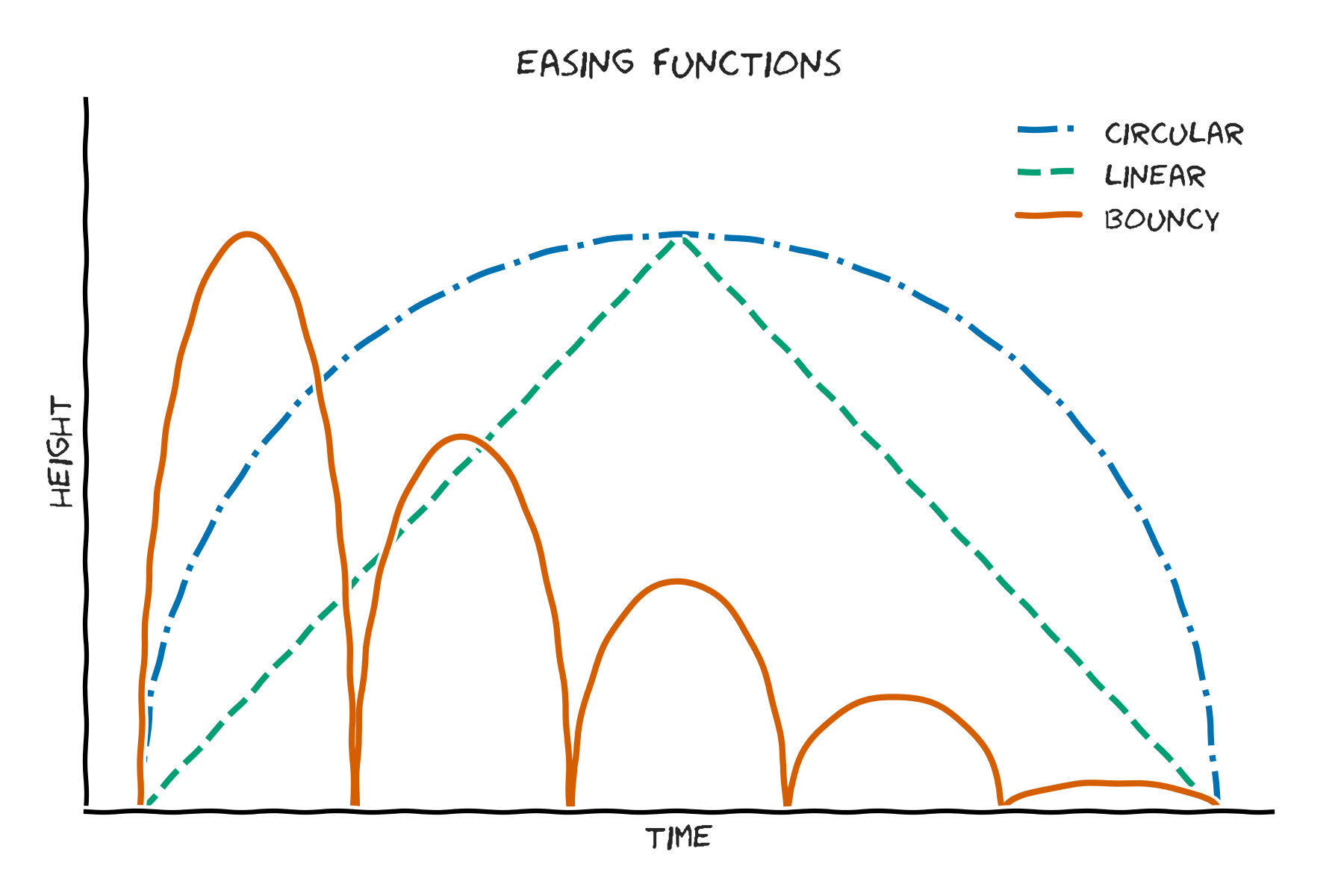
The basic idea of what we’re trying to accomplish with our ‘W’ is to make it jump up and down. The first major question that we’ll need to address is how exactly we want it to jump. We’re going to need to define where the letter is going to be at each point in time in order to fully determine what the jump will look like. You typically call the functions that determine these transitions between two points easing functions, but here we’ll extend that concept to include the return back to the starting position. You can see here a couple of different possibilities which will have qualitatively different behavior.

The linear function will look smooth with abrupt changes in direction while the circular one will look more “realistic” because it closely resembles the parabolic trajectory that we would expect from Newtonian mechanics.
Bouncy, on the other hand, is just a series of circular hops with each sequential hop reaching a lower maximum height… you know, bouncing.
If we limit the time to the range of zero to one, then we can define the linear and circular easing functions in JavaScript as follows.
// return a linear/triangular jump for times in the range of [0, 1]
const linearEasing = (time, maximumHeight=1) => (
  maximumHeight*(time < 0.5 ? 2*time : 2*(1 - time))
);

// return a circular jump for times in the range of [0, 1]
const circularEasing = (time, maximumHeight=1) => (
  maximumHeight*(2*Math.sqrt(0.25 - ((time - 0.5)**2)))
);
Now we just need to construct SVG animation instructions that we can integrate with our SVG image of a ‘W’. Support for SVG animation is provided via Synchronized Multimedia Integration Language (SMIL)… which is honestly kind of complicated. Luckily, we’ll only need to use one relatively simple part in order to animate our element.
<animateTransform
  attributeName="transform"
  type="translate"
  attributeType="XML"
  dur="5s"
  values="0 0 ; 0 -10 ; 0 0"
  keyTimes="0 ; 0.5 ; 1"
  repeatCount="indefinite"
/>
If we stick this animateTransform element inside of another element—say our path outlining the ‘W’, for example—then it will be animated according to the x y translation sequence specified in values and the corresponding key times specified by keyTimes.
In the example above, the animation will start with no translation because the first x y pair is 0 0, then it will be translated upwards 10 pixels at halfway through the duration because the second pair is 0 -10, and finally it will return to its original position because it ends at 0 0.
The animation will repeat indefinitely due to repeatCount being set to "indefinite" and the entire duration of one loop will be 5 seconds thanks to dur="5s".
To define other paths of motion, we simply need to specify their corresponding keyTimes and translation values which can easily be calculated using our easing functions.
We only used three key times in this simple example, but adding more will allow us to more accurately approximate the trajectory defined by any given easing function.
You can think of each time and translation position like a frame in a movie; the more frames we have, the better the actual motion will be represented.
Putting this all together, we can define a relatively simple animateSvg() function which uses a ES6 template literal to populate the proper attributes within our ‘W’ SVG.
The function arguments will allow us to specify the height in pixels that the W will jump (jumpHeight), the duration of the animation in seconds (duration), the easing function (easing), and the number of translation positions that we’ll provide explicit values and times for (frames).
const animateSvg = (jumpHeight=50, duration=1, easing=circularEasing, frames=100) => {
  // get a sequence of evenly spaced time values for each key frame
  const times = [...Array(frames + 1).keys()]
    .map(index => index / frames);
  // find the height at each of these times according to the easing function
  const heights = times.map(time => easing(time, jumpHeight));
  // we'll actually want these to be negative because the origin is in the upper right
  const negativeHeights = heights.map(height => -height);

  // translate the times in to the `keyTimes` semi-colon delimited format
  const keyTimes = times.join(' ; ');
  // translate the heights into the `x y` pair format of `values`, with all x=0
  const values = `0 ${negativeHeights.join(' ; 0 ')}`

  // fill the appropriate variables into a template version of the SVG
  return `
    <?xml version="1.0" encoding="UTF-8" standalone="no"?>
    <svg
      xmlns:dc="http://purl.org/dc/elements/1.1/"
      xmlns:cc="http://creativecommons.org/ns#"
      xmlns:rdf="http://www.w3.org/1999/02/22-rdf-syntax-ns#"
      xmlns:svg="http://www.w3.org/2000/svg"
      xmlns="http://www.w3.org/2000/svg"
      version="1.1"
      width="68"
      height="${147 + jumpHeight}"
    >
      <g transform="translate(8 ${jumpHeight})">
        <path
          style="fill:#a92e34;"
          d="m 52.182318,120.721 0,-108.035005 -15.345,0 0,110.205005 c 0,1.24 -0.31,2.17 -1.55,2.17 l -1.395,0 0,-112.375005 -15.345,0 0,112.375005 -1.705,0 c -0.93,0 -1.395,-0.77501 -1.395,-2.17 l 0,-110.205005 -15.345,0 0,107.88 c 0,10.84998 5.5800109,16.43 16.43,16.43 l 19.22,0 c 11.469988,0 16.43,-6.04502 16.43,-16.275"
        >
          <animateTransform attributeName="transform"
            type="translate"
            attributeType="XML"
            dur="${duration}s"
            values="0 ${values}"
            keyTimes="${keyTimes}"
            repeatCount="indefinite"/>
        </path>
      </g>
    </svg>
    `;
}
There are a couple of small side things going on—like increasing the height of the image to accommodate the jump and moving the starting position of the ‘W’ down by the full jumpHeight—but the main thing is that we’re populating the animateTransform attributes according to the specified duration and the translation values which we calculated using our easing function.
It’s pretty simple overall and it gives us an easy way to generate animated SVG files in a browser according to customized parameters.
The default arguments specified in the function, for example, produce the following bouncy ‘W’.

There’s obviously a bit of book-keeping involved when extending it to the full tool above, but that’s the basic idea!
Conclusion
I hope that you’ve enjoyed learning about how we helped design the new Wayback Machine loading animation. If you would like to help support the Wayback Machine yourself, then please consider making a donation to the Internet Archive. They’re a non-profit organization which relies on our donations to help preserve and share historically significant website snapshots, video games, music, and more.
Also feel free to get in touch with us here at Intoli if you’re looking for some outside expertise surrounding web scraping and data intelligence. We love tackling challenging problems, and we look forward to hearing about what you’re working on!
Suggested Articles
If you enjoyed this article, then you might also enjoy these related ones.
The Red Tide and the Blue Wave: Gerrymandering as a Risk vs. Reward Strategy
An interactive explanation of how gerrymandering is a risky strategy that allows for the possibility of a blue wave.
Performing Efficient Broad Crawls with the AOPIC Algorithm
Learn how to estimate page importance and allocate bandwidth during a broad crawl.
User-Agents — Generating random user agents using Google Analytics and CircleCI
A free dataset and JavaScript library for generating random user agents that are always current.

Comments